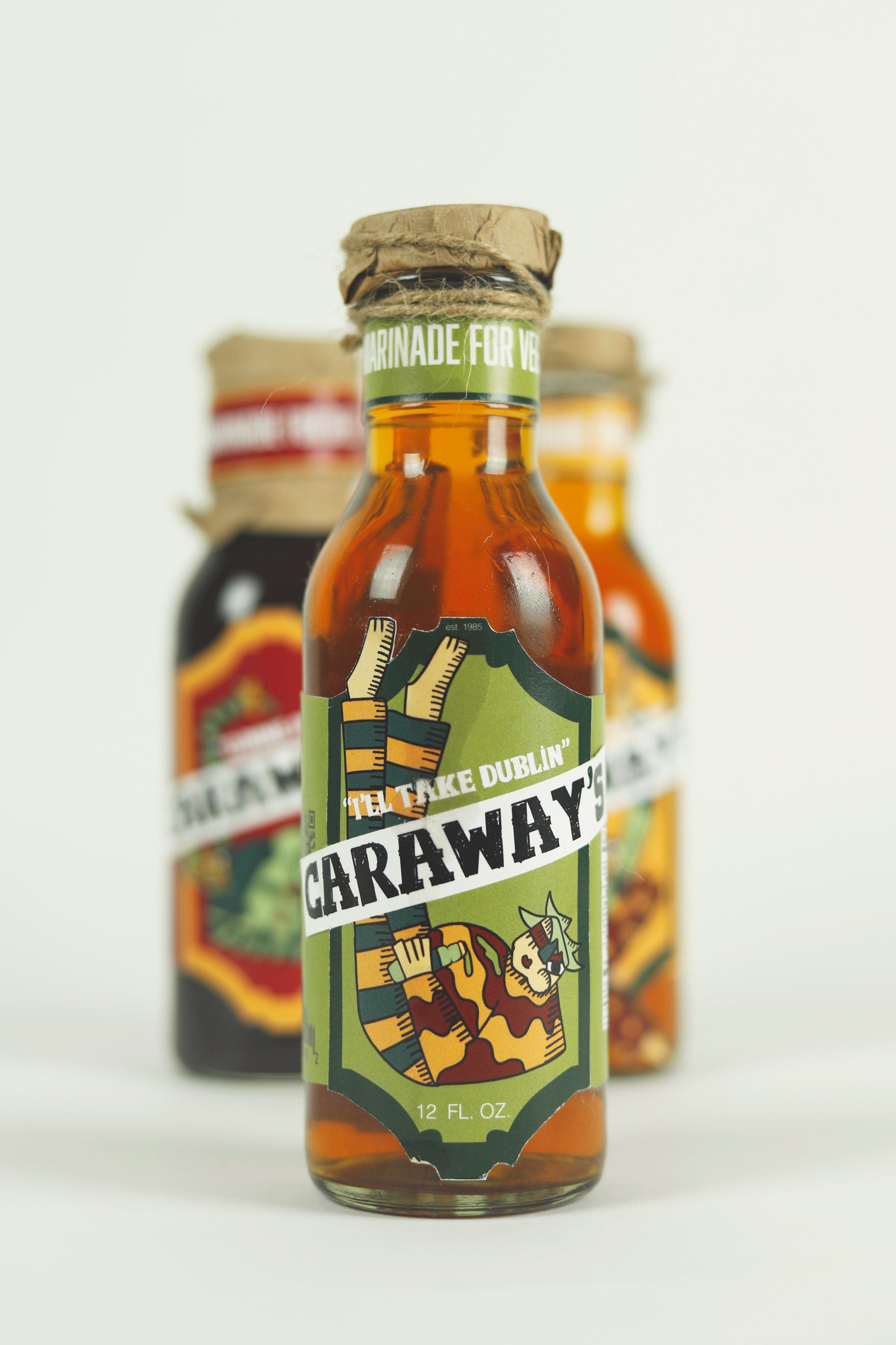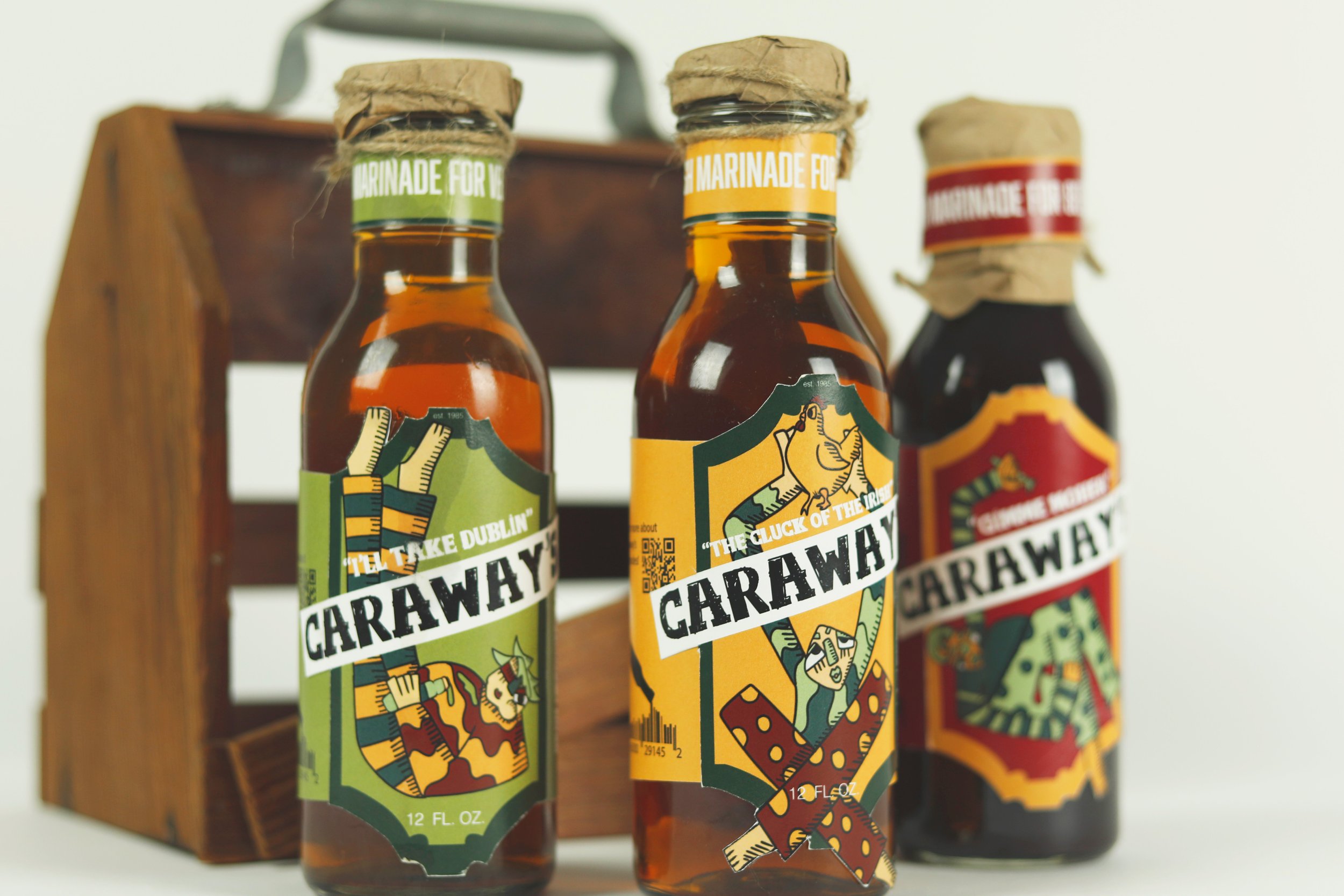
Caraway’s Marinade
Designs Skills
Branding
Illustration
Packaging
Caraway’s is an Irish marinade made locally in the town of cork, Ireland. Cork is Ireland’s Foodie Capital. It is know for its incredible English Market. Caraway’s was developed in 1985 when an Irishman and his family were tired of the same old meat and potatoes and wanted to spice things up for a change. Although Ireland as a whole isn’t know for it’s food, Caraway’s gives eating Irish foods a new meaning. The Marinade was sold in the English Market but now has made it’s way across and Ireland and the States.
The Caraway’s Marinades come in three different flavors. For Example, our beef marinade, is an Irish take on BBQ named “Gimmie Moher”, referencing the breath taking scenes of the Cliffs of Moher.
The Goal of the product is to not only taste great and adds flavor to any meal but also honors and celebrates Irish Culture.
LOGO
When thinking about the logo, I wanted to keep it as a logo type and let the illustrations shine. I stayed away from any iconography for the logo. The logo type is adapted from the Font Pulpo Rust. The logo shows the toughness and the life as an Irish man or woman in Cork, Ireland.
Color
Each color corresponds with the type of marinade that it holds. Green for veggie, yellow for chicken, red for beef. Black is used mostly for type within the design.
Type
The type Pulpo Rust 100 was chosen for it’s grit and rough nature. Ski regular reminded me of Irish culture because of its ancient quality, it also has readable figures.
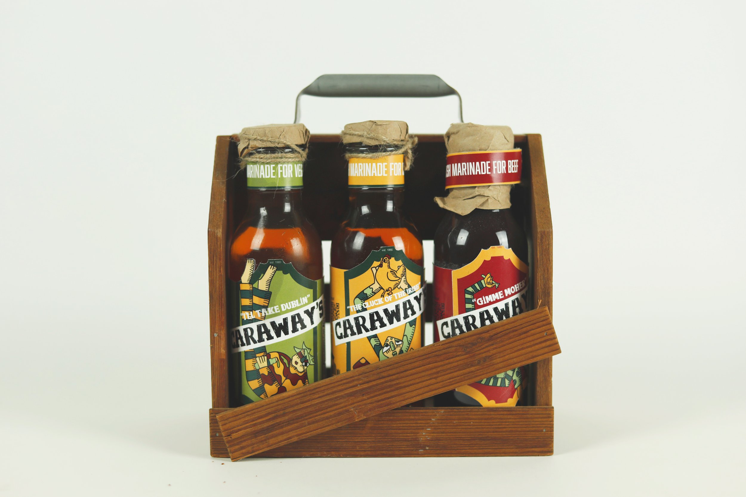

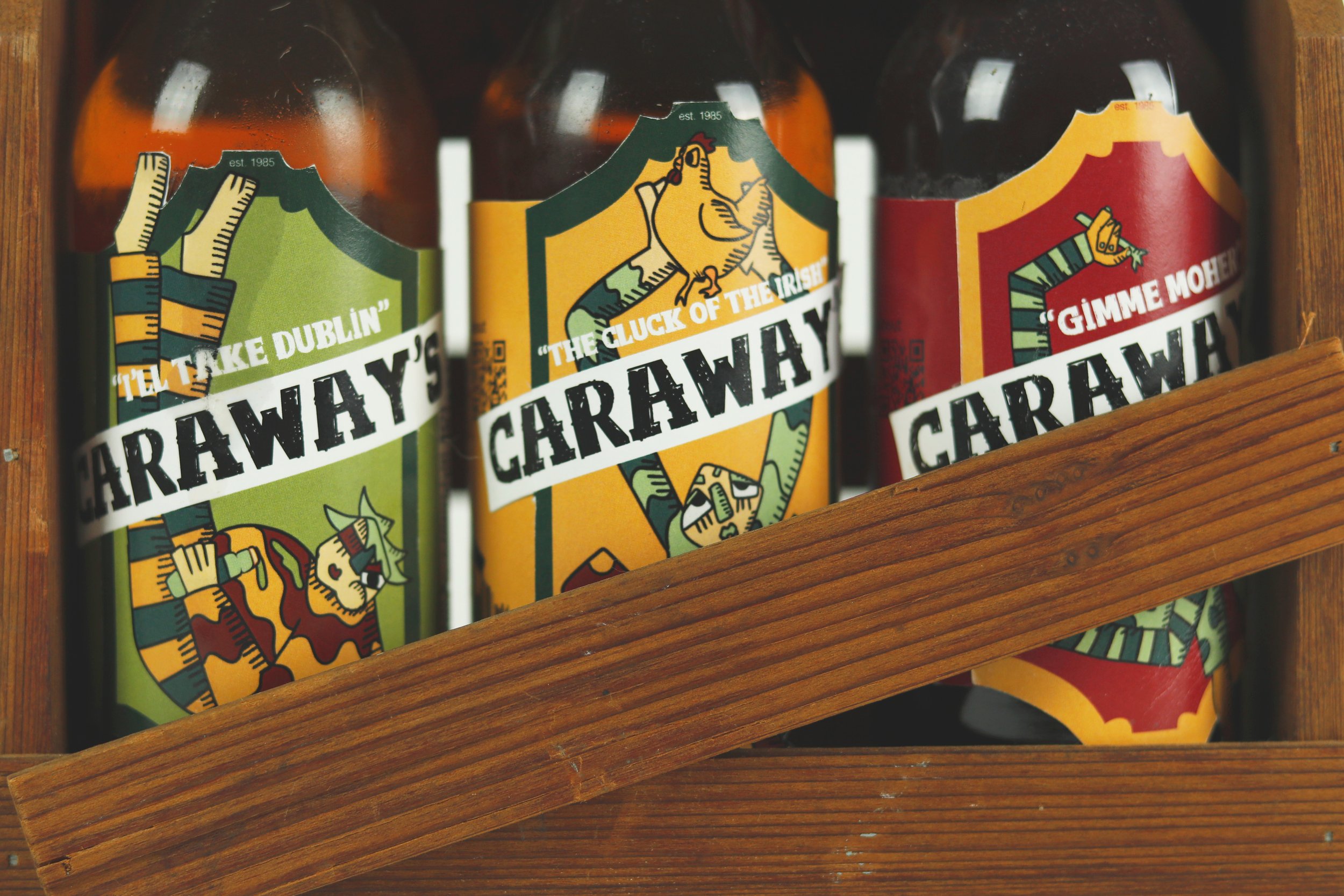
I’ll Take Dublin — The Veggie
Gimme Moher — The Beef
Cluck of the Irish — The Chicken


